RADIO-SONDE
Hadley Radio-Sonde Data
Ground based weather stations measure temperature close to the ground, normally in a special enclosure between 1.25 and 2.0 m above the ground. Satellites can only measure temperature over a wide rage of heights above ground level. Knowledge of temperatures at specific heights above ground level is necessary for a complete understanding of how the climate is changing. To provide such data radio-sondes are used. These use balloons to carry instruments to heights of up to 30 km (20 miles).Radio-Sonde Temperature
Figure 1 is based on data prepared by the Hadley Centre of the British Meteorological Office. It shows the annual average global temperature at different atmospheric pressures in Pascals. This graph shows that whilst temperatures at ground levels and the lower atmosphere have been increasing, temperature in the upper atmosphere (20 km) have fallen over the last 50 years.http://www.climatedata.info/
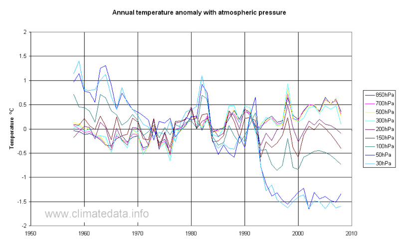
The approximate equivalent heights are:
| Pressure (Pa) | Height (km) |
| 30 | 21.6 |
| 50 | 19.3 |
| 100 | 15.8 |
| 150 | 13.5 |
| 200 | 11.8 |
| 300 | 9.2 |
| 500 | 5.6 |
| 700 | 3.0 |
| 850 | 1.5 |
CO2 Signature
One of the key aspects of climate change is the “signature” or “finger print” which would be left by different types of climate change. Different types of warming result in changes in temperature in specific latitudes or at specific heights. Figure 2, taken from the IPCC 2007 Technical Assessment Report, shows the pattern of global warming from a range of GCMs. It is based on the period 1890 to 1999 and gives temperature increase in degrees per decade. It shows that the temperature increase projected by the models will result in an increase of temperature in the equatorial regions at heights of between 7 and 14 Km of 1.4 ºC per century. This increase in the upper troposphere temperature is related to the greenhouse effect of water vapour. The presence of the hot-spot in the tropics is considered to be a “finger-print” for CO2 forcing of the temperature changes.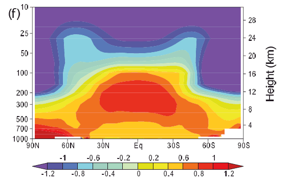
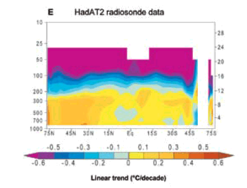
Figure 3 is based on radio-sonde readings for the period 1958 to 2008 (the same data as Figure 2). It is based on data from the Hadley Centre and was processed by ourselves. The data gives values of temperature for each year, for each month, for each latitude, for each longitude and for each of the values of atmospheric pressure in the above table. The data are on a grid of 10º for longitude and 5º for altitude. For the analysis we used a simple robust algorithm. Data was divided into two periods: 1958 to 1975 and 1976 to 2008. These periods were chosen as there was little warming in the first period but a general warming trend in the second period. We took the average of the values of temperature for each latitude and each pressure. This gave a table of 36 by 9 values. The average was calculated for each cell if there were more than 10 data items available; in fact either there were many more values, thousands in most cases, or there was no data. The rate of increase per decade was taken as the difference in the two values divided by 2.5. Note that the chart is reversed relative to the IPCC chart with latitude running in the opposite direction and the units degree C per decade (not per century as the IPCC figure). Whilst not as clear cut as the IPCC figure, there is some evidence of warming in the 8 to 12 km height.
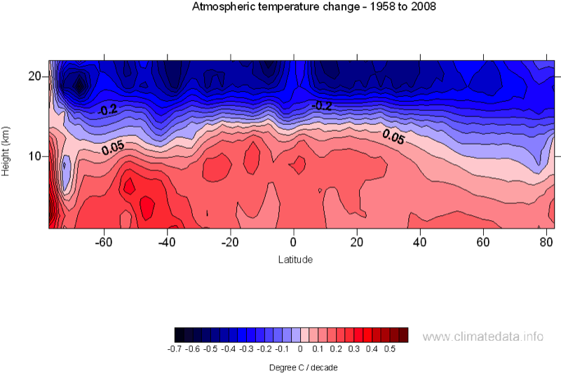
Figure 4 is reproduced from the US Climate Change Science Program report, “Steps for Understanding and Reconciling Differences: Final Report, Synthesis and Assessment Product 1.1, Chapter 5, Temperature Trends in the Lower Atmosphere: May 2006”. It is reversed relative to our own chart but the shape is in general agreement with our own. The data period used for this graph is 1979 to 1999.