TEMPERATURE EFFECTS
Introduction
The measurement of temperature is behind much of the discussion on climate change. Networks of instruments to measure temperature date from the 19th century. Over the years there have been many attempts to reconstruct the earth’s temperature for earlier periods. These use proxy information on climate preserved in tree rings, ice cores, sediments, coral, stalagmites etc. The written historical record relates mainly to the northern hemisphere and suggests there were periods which were much colder than the present (the Little-Ice Age) and others which were at least as warm, if not warmer, than the present (the Medieval Warm Period). When these proxies are analysed however there is only limited correspondence between different records and the historical record.http://www.climatedata.info/
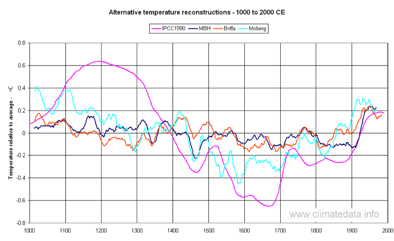
Figure 1 shows four reconstructions. The one marked IPCC 1990, appeared in the 1990 Assessment Report as Figure 7.1c. Although it was described as a "schematic diagram of global temperature variation" it appears to have been based mainly on Central England Temperatures. The next chronologically, marked MBH (Mann, M.E., Bradley, R.S., Hughes, M.K., Global-Scale Temperature Patterns and Climate Forcing Over the Past Six Centuries, Nature, 392, 779-787, 1998.) appeared in the IPCC 2001 Assessment Report. This graph suggests that temperature variation in the past was limited and the current period is warmer than any in the past 1000 years. The third sequence marked Briffa (Jones, P.D., Osborn, T.J. and Briffa, K.R., 2001 “The evolution of climate over the last Millennium.” Science 292, 662-667) was also published the IPCC. Whilst there are differences in the timing the overall range of temperatures is similar to the MBH reconstruction. The most recent of the temperature reconstructions shown is that by Moberg (Highly variable Northern Hemisphere temperatures reconstructed from low- and high-resolution proxy data : Nature, Vol. 433, No. 7026, pp. 613 - 617, 10 February 2005). This reconstruction is for the Northern Hemisphere only and clearly shows the Medieval Warm Period (100 to 1200) and the Little Ice Age (1500 to 1700). The three later estimates were all published with error bands and it is likely that no one of them is fully outside the bands of the others. It would appear that present techniques do not permit precise, consistent, estimates of past temperature. For more detail on the use of tree rings and ice cores see our proxies section.
Measured Temperatures
At a global scale, observed temperatures are covered by five main data sets:- The Climate Research Unit (CRU) at the University of East Anglia in conjunction with the Hadley Centre, British Meteorological Office.
- NASA’s Goddard Institute for Space Studies (GISS).
- The National Climatic Data Center (NCDC) of the National Oceanic and Atmospheric Administration.
- The University of Alabama, Huntsville (UAH)
- Remote Sensing Systems (RSS)
Satellites have the advantage that they provide uniform coverage of the whole earth except for small regions near to the poles. These areas represent about 3% of the earth’s surface. Both land based and satellite data need continual revision. In the case of land based stations, it is necessary to allow for the “urban heat island effect”. This refers to the fact that meteorological stations in urban areas record higher temperatures than those in nearby rural locations. Reasons for this include the proximity of heated buildings and exhaust from air conditioning units and vehicles. All the land based data sets compensate for this effect. For example the GISS data set adjusts the rate of rise of urban stations so that it is similar to nearby rural stations; if there is no nearby rural station then the data is not used. In the case of satellites, adjustments have to made for changes in the satellites’ orbits and the deterioration of sensors. It is also necessary to make adjustments when one satellite is replaced by another.
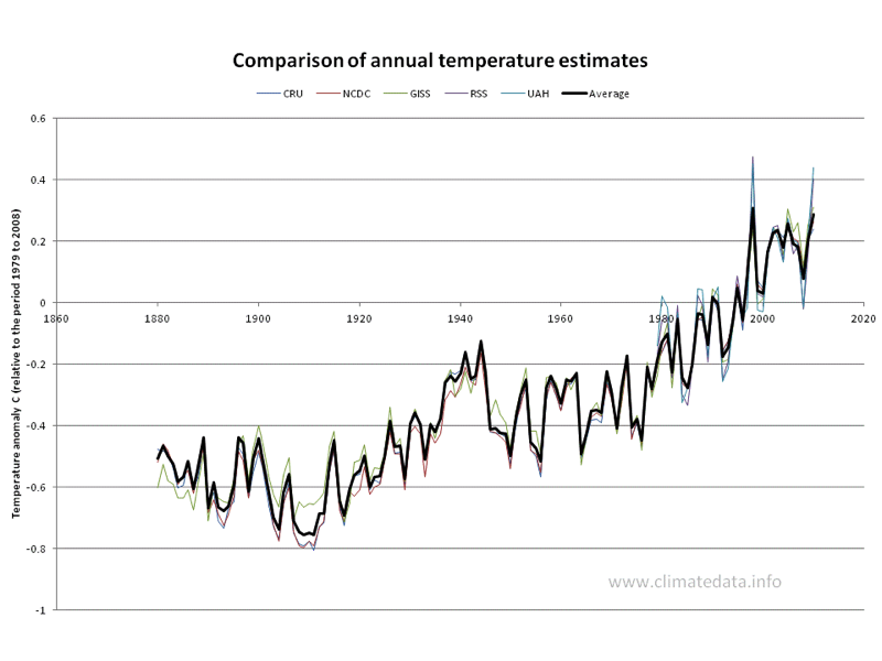
Figure 2 shows annual temperatures for the whole earth from all five measurement sources. It is normal to express temperatures as the difference between a given value and the average for a fixed period, usually 30 years. In this case we have chosen the period 1979 to 2008. This enables satellite data to be plotted on the same graph as land-based data without need for further adjustment. In terms of quality of data, the graph shows that all temperature estimates are broadly consistent. The differences are slightly larger in the early years, when there was a limited number of stations. A second feature is that the satellite temperature records seem to have more variance; hot years are relatively hotter and cold years are relatively colder.
Using the average of the three long-term stations there were distinct periods in the last hundred years:
- 1909 to 1944: an increase of 0.61 ºC,
- 1944 to 1975: fluctuating temperatures with an overall fall of 0.35 ºC,
- 1975 to 2005: an increase of 0.75 ºC.
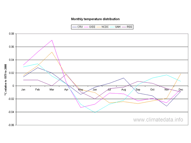
Another way of comparing the temperature records is to consider how they represent the seasonal variation in temperature (Figure 3). The land-based temperature data sets tend to have higher temperatures in the early months of the year whereas the satellite based record shows maxima in the early and late months.
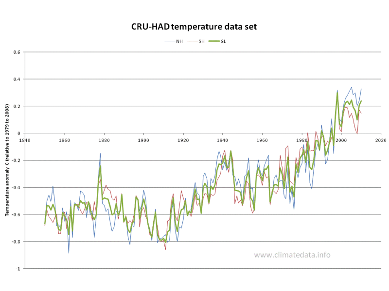
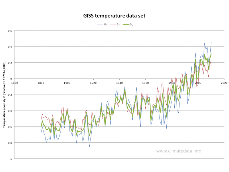
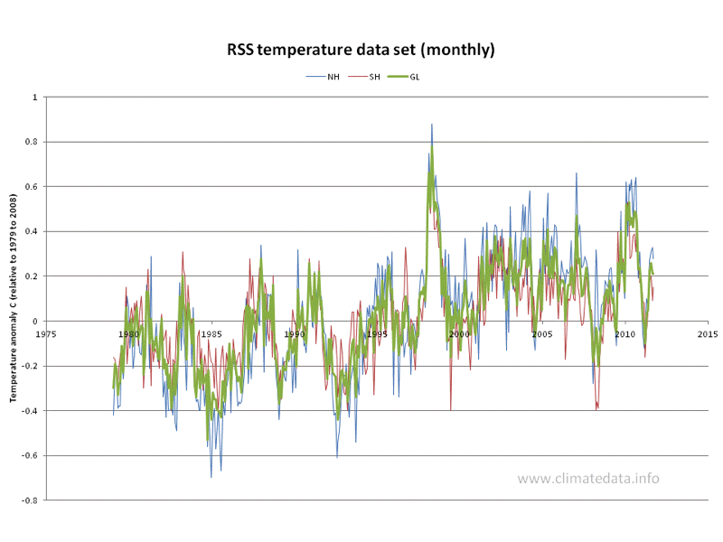
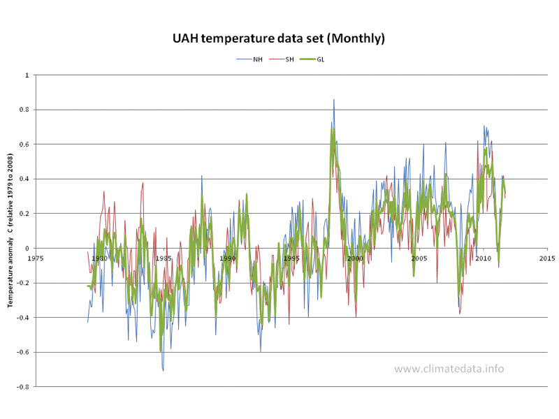
Data produced by the Climate Research Unit and the Hadley Centre has the longest record (Figure 4). This has been achieved in part by direct contacts between the Unit and national meteorological services. The record suggests that up to 1880, when the other records started there was a slight warming. One noticeable feature is that during warming periods the northern hemisphere temperatures increase more than southern hemisphere and vice versa. This may be related to the fact that the northern hemisphere has more land than the southern hemisphere and consequently responds more quickly. The GISS data set shows a similar trend in hemisphere temperatures (Figure 5). The satellite record covers a shorter period but also show a similar trend. The RSS and the UAH data sets are shown in Figure 6 and Figure 7, respectively.
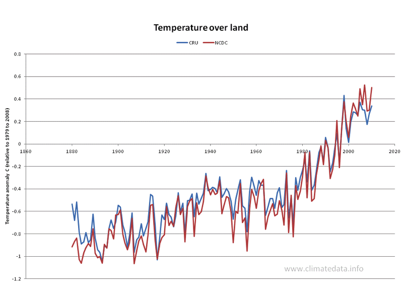
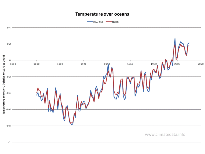
The CRU and NCDC data sets have separate values for oceans and land. The data values for land are shown in Figure 8. As can be seen both data sets are in good agreement. One thing which is noticeable is that earlier period of warming, 1909 to 1944, is not as pronounced as the second, 1975 to 2005, when compared to the global measurements above. The data values for oceans is shown in Figure 9. In this case the oceans, the early warming period is much more prominent. This difference in behaviour is more clearly seen when we compare the difference between land and ocean temperature values (Figure 10).
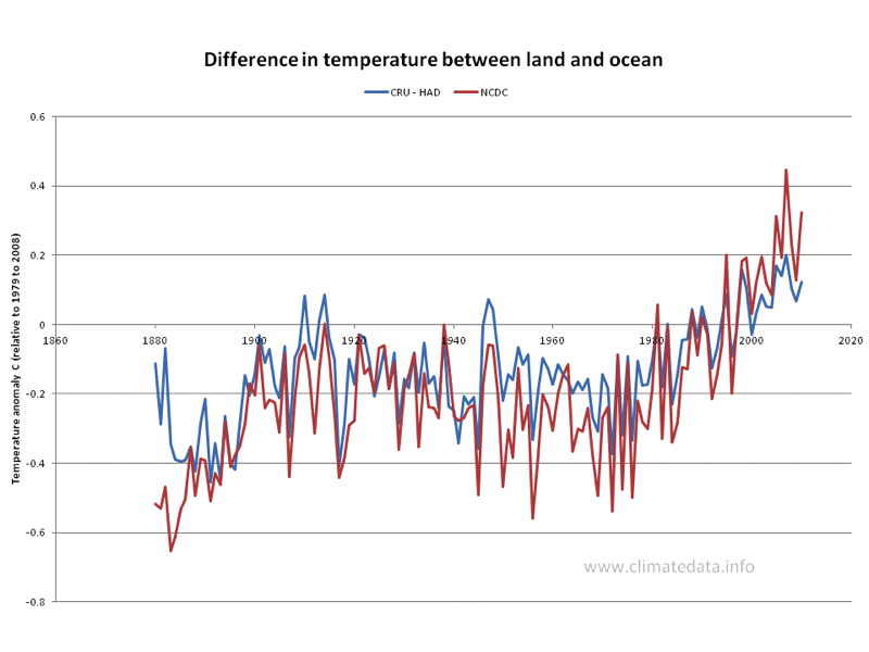
As we have seen above, in the 20th century there were two similar warming periods, of 0.61 ºC from 1909 to 1944 and of 0.75 ºC. from 1975 to 2005. This graph shows that for the first of these the relationship between land and sea temperatures remained almost constant, and only changed little during the mid-century cooling period. During the second warming period land temperatures increased rapidly compared to sea temperatures and have continued to do so even though the rate of temperature increase has levelled off since the start of this century. It generally accepted that the first warming period was natural and the second was a result of CO2 and other anthropogenic greenhouse gases. If this is the case then it appears that anthropogenic warming affects land in different way to the oceans whereas natural warming does not. Another possible explanation is that despite the efforts of meteorologists to minimise heat island effects the higher land temperatures are caused by extra heat sources around and based temperature measurements.