GLOBAL TEMPERATURE SIMULATION
The first graph (Figure 1) shows observed temperature for the period 1870 to 2011 based on the HadCRUTv3 data set. We have also plotted simulated temperature for seven models and 2 scenarios. The first scenario was the 20c3m scenario which was the simulation of global temperature up to 1999. The second scenario shown for 1970 to 2030 is the a1b scenario which is usually taken to represent the projection without any major changes in the pattern of CO2 emissions. This scenario also included a simulation of 20th century temperature leading up to the projection but a slightly different sub-set of model runs; as can seen be for the period of overlap they were very similar. We have also shown the envelope of all monthly model simulations (the approximate equivalent of the yellow lines on the IPCC chart).
http://www.climatedata.info/
For the common period this graph and that published in the IPCC TAR4 are similar. The main difference is that the line representing the simulations has less variation than in the IPCC graph, surprising as we use fewer models and fewer simulations. In particular the drops in temperature following volcanoes are less accentuated than in the IPCC graph. It is known that some models give more weight to volcanic aerosols than others and it may be that the models we used does not include them.
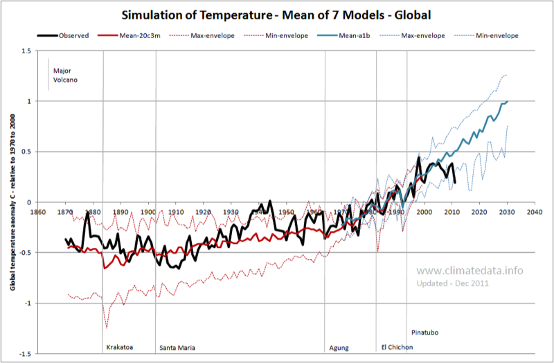
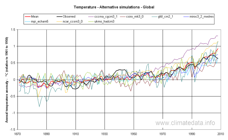
Figure 2 shows the same observed temperature but with the simulation of all 7 models. Where data were available for several simulation with a single model they were averaged for this graph. As can be seen the observed values generally fall within the range of modelled values. The most marked departure is in the 1940s, when observed temperatures are higher than any modelled values. By contrast the low temperature at the start of the 20th century is generally overestimated by the models.
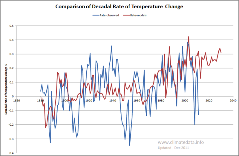
This is seen more clearly in Figure 3, which shows the decadal change in simulated (average of all models) and observed temperature. This graph shows that the models in general performed well from the mid-1970s to the end of the century, when they were simulating the increase in temperatures due to CO2, but less well at other times. In particular:
- The observed natural rate of increase from 1910 to 1940 averaged 0.151 C/decade but the rate simulated by the models was 0.037 C/decade
- The two periods of natural cooling, at the start and middle of the 20th century, were not represented in the simulated temperatures. A similar observation appears to be true in relation to the start of the 21st century when the models projected a steady increase but observed values have not shown such a trend.
Model Simulation of Temperature Anomoly – Europe and North America
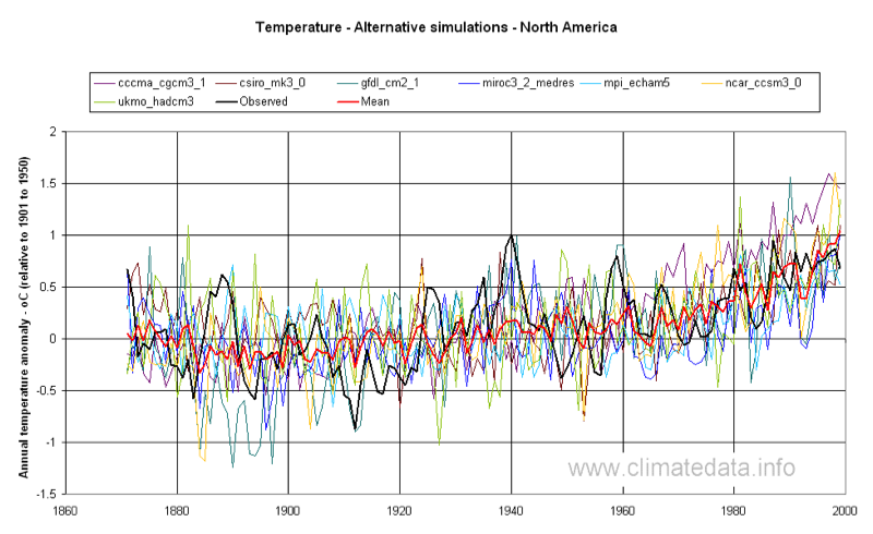
There is some doubt as to the accuracy of the global temperature anomaly data. We therefore compared the simulated values with those for Europe (actually the area 5ºW to 40ºE and 45ºN to 60ºN) which has had good coverage by climate stations since the mid-nineteenth century (Figure 4). We have also repeated the exercise for North America (Figure 5), which also has good long-term temperature records. In this case the area covered was 30 ºN to 55 ºN and 120 ºW to 140 ºW. In both cases the mean of the models exhibits less variance than the observed data.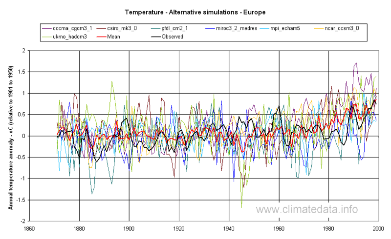
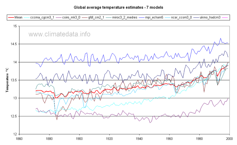
Model Simulation of Global Temperature - Celcius
Figures 1- 5 show the temperature expressed as the anomaly with respect to the period 1901 to 1950. In Figure 6 the simulated global temperature is expressed as degrees Celsius. In this graph we have shown the mean of all models but have not shown the observed mean as there is some uncertainty as to its exact value. The range of average temperature is from 12.6 to 14.2 ºC. In terms of long-wave radiation, and assuming that Stefan-Boltzmann’s law is valid, this is equivalent to a difference 8.6 W m-2.